N 1744
Team Logo Design
World F3A Team Logo's
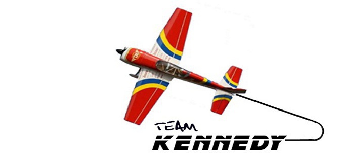
I started several years back when I developed the Team Kennedy logo as seen on
the web page. It started with a unique color scheme for my competition airplanes
that at the time was non-traditional. Most everyone had the colors sweep from
root leading edge of the wing out toward the tips at the trailing edge, as if
something was draped around the fuselage and over the wing in flight. I wanted
a reverse sweep on the wings with a white center section and red at the wing
tips. For me this was very visable in the air. This scheme and the original Team
Kennedy logo have changed very little since the original design.
I have always enjoyed being creative and coming up with logo ideas that tie the
event into the venue or situation. I was asked several years back to come up with
a design for the USA F3A precision aerobatic team logo for the 2005 world
championships. Since that design I have developed the 2007 and now the most
recent 2009 USA team logos. Below are images of the logos with a description of
how they came to be. Hope you enjoy.
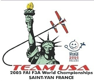
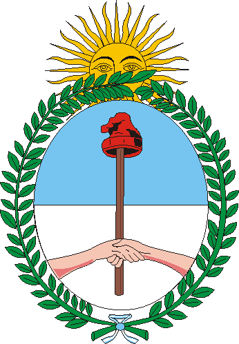
The 2005 world championships were held in Saint-Yan
France. During this time tension between the United
States and France was somewhat high. The concept for
this logo was to come up with something that did not
flash the Stars and Strips everywhere while the team was
there but would show respect, gratitude, and thanks for
something that had ties to both countries. This is when
the pattern plane flying around the statue of liberty came
to life. I felt like this would highlight the Team USA spirit
yet tie us back to France in a way that would not add to
the tension. Everyone liked this logo and the team
proudly displayed the logo on our shirts, hats, and jackets
while competing in France.
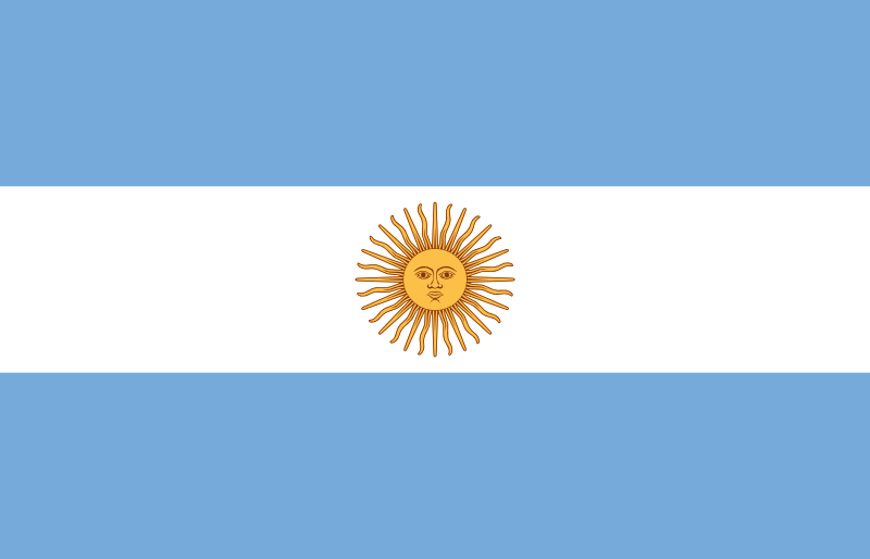
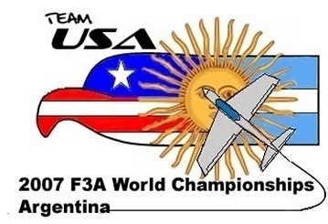
The 2007 world championships would find the US team
competing in Argentina. This was a very fun logo to
develop. After doing some research on Argentina I felt the
country flag was very unique with the suburst and then
the country coat of arms had the same sunburst however
part of the face was covered.
From these the idea to somehow use the sunburst as the
center of the logo and then have the USA and the
Argentine flag connected out each side as if the sunburst
moved forward from the center of the flag leaving USA
and Artentina appearing from behind the sunburst. I have
tried to keep consitency with the Team USA image in each
logo. Next, the pattern plane flying in knife edge over the
face of the sunburst added that final touch as with the
coat of arms. the result was the Team USA proud Eagle
and Stars and Stripes on the left and the Argentina
country flag on the right with the sunburst as the center
piece.
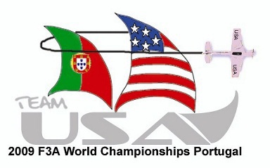
Above is the concept drawing for the 2009 Team USA logo. The
worlds this year are held in Portugal. I began the research for this
logo soon after the 2007 worlds when I was asked to develop the
next one for Team USA.
Many of the significant events in the history and heritage of Portugal
inspired me to create the the team USA logo for the 2009 F3A world
championships.
Portugal spearheaded the exploration of the world and undertook the
age of discovery. Important people like Henry the navigator and
Magellan as examples. Magellan was the first person to lead an
expedition across the Pacific Ocean and also led the first successful
attempt to circumnavigate the earth.
The ship that truly launched the first phase of the Portuguese
discoveries was the caravel.
We are very proud to be from the USA with our rich heritage, and we
enjoy traveling to many countries around the world as Magellan did.
Many hours of research and thought went into the logo for the
upcoming worlds being hosted by Portugal. I wanted to recognize
Portugals rich heritage and ours but show we understand the
importance of Portugals early explorations during the age of
discovery.
I wanted to maintain the look of the "Team USA" presenting the text
as we have in the past keeping the consistant look. I tried to include
some sort of airplane theme so having it perform a aerobatic knife
edge turn around the sails seemed appropriate leading the way to
the next victory.
If you take a look at the logo, you will see that the "Team" creates
the upper rear portion of the caravel while the "USA" clearly is the
foundation of the ship,the hull. Our proud stars and stripes catch the
wind and fly out front representing the 50 great United States, and
we honor our host conuntry Portugal flying their colors.
I see for us our adventure will begin by traveling to a new location in
the world, meeting new people, seeing new sites, making new
discoveries working hard as a great team much like the crews did on
a caravel to sail back home with the richest reward of all. The 2009
F3A World Champion.
I hope you have enjoyed reviewing these logo designs as much
as I did creating them. Feel free to click on email and tell me
what you think?
Bryan